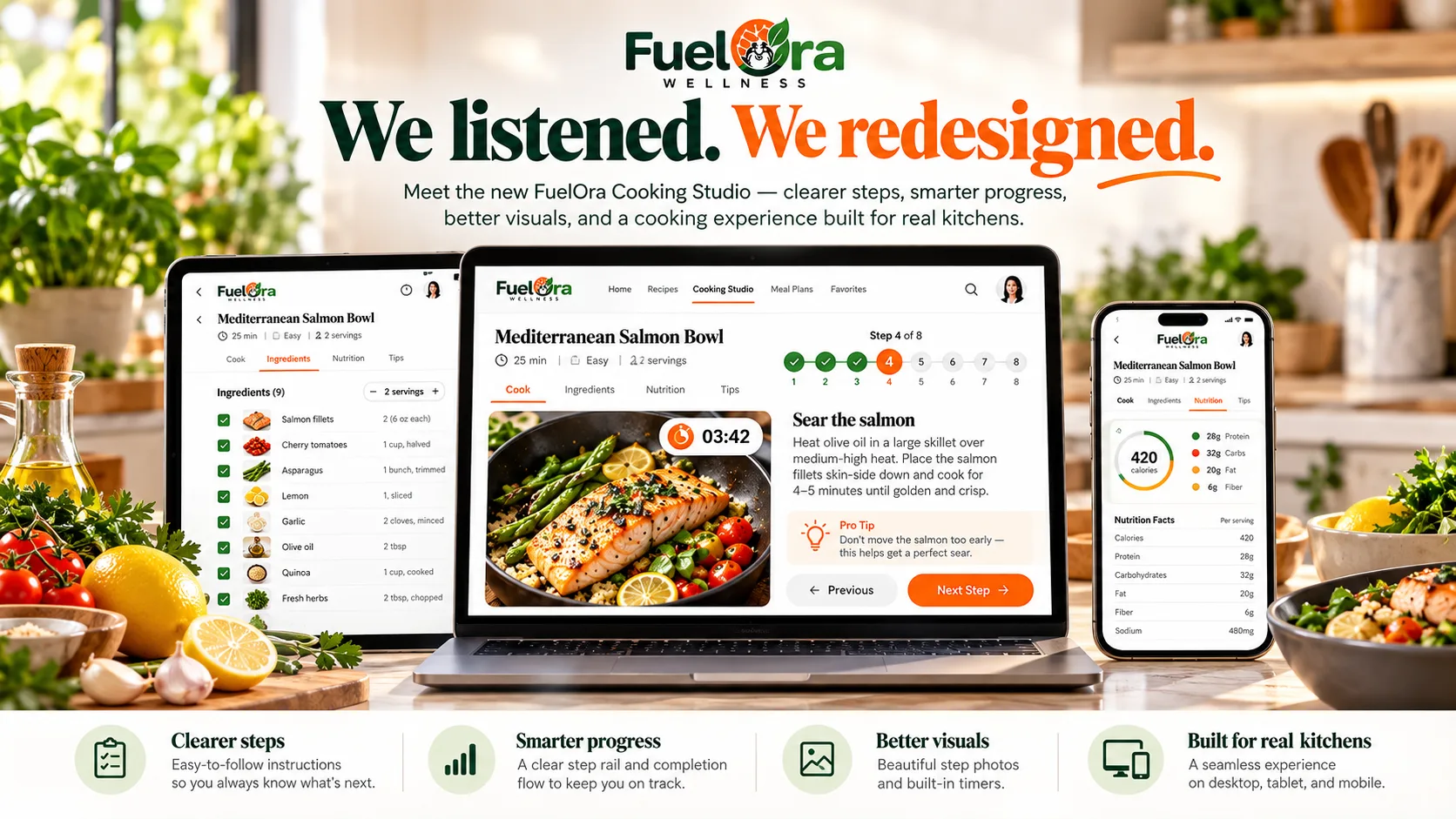
Cooking shouldn’t feel like reading an instruction manual.
When you’re standing in the kitchen with a hot pan, chopped vegetables, and several things happening at once, the last thing you need is a screen full of tiny text, confusing navigation, or instructions that make you stop and figure out what comes next.
At FuelOra Wellness, we believe technology should reduce the mental load of cooking — not add to it.
That belief led us to rethink FuelOra Cooking Studio.
We started by listening
Before redesigning Cooking Studio, we looked beyond our own assumptions.
We reviewed public feedback from people using cooking and meal-planning apps to understand what they value when they are actually standing in the kitchen — and what gets in their way.
The feedback pointed to a clear pattern.
People appreciate step-by-step cooking because it removes uncertainty. They value clear instructions, integrated timers, helpful visuals, and a smooth connection between planning, grocery preparation, and cooking.
But people also become frustrated when instructions feel cluttered, step images do not match what they are doing, controls are difficult to reach, or the app makes them think too much about the interface itself.
The conclusion was simple:
During cooking, clarity matters more than complexity.
The kitchen is different from every other screen
Most digital products are designed for browsing.
Cooking is different.
Your hands may be wet. Something may already be heating. A timer may be running. You may only have a few seconds to look at the screen before turning your attention back to the food.
That means a cooking interface should not behave like a traditional dashboard.
The question should not be:
How much information can we place on the screen?
The better question is:
What does the cook need to know right now?
That became one of the core design principles behind the new FuelOra Cooking Studio.
One step should feel like one step
In the redesigned experience, the current cooking instruction becomes the center of attention.
Instead of asking users to scan a page to work out where they are, FuelOra gives the active step strong visual priority.
Dice the onion.
Wilt the spinach.
Add the paneer.
Serve with the warm roti.
Supporting information — ingredients, equipment, timing, imagery, and progress — sits around the current instruction rather than competing with it.
The goal is simple: look at the screen for a moment and immediately understand what to do next.
Progress should be clear without becoming distracting
Cooking has momentum.
Once you begin moving through a recipe, you should always understand where you are without having to think about it.
The redesigned Cooking Studio makes progress easier to understand at a glance.
- Completed steps are clearly distinguished.
- The active step is visually prominent.
- Upcoming steps remain visible without competing for attention.
- Overall progress is easy to understand.
- Navigation stays available without interrupting the cooking flow.
You can see the journey without losing focus on the task in front of you.
Visual guidance should actually help
A cooking image is useful only when it corresponds to what you are doing.
That sounds obvious, but mismatched or repetitive step imagery can quickly undermine confidence in a cooking experience.
In the redesigned FuelOra Cooking Studio, step imagery has a more meaningful role.
When a relevant image is available, it becomes part of the active cooking workspace rather than a small decorative element.
You are not only reading:
Dice the onion.
You can also quickly see what that step should look like.
And when imagery is not available, FuelOra keeps the experience clean rather than pretending otherwise.
Timing should reduce mental load
Cooking rarely happens as a perfectly linear sequence.
Something may be simmering while you prepare another ingredient. A pan may need a few minutes. Dough may need time to rest. Vegetables may need to soften before the next ingredient goes in.
You should not have to keep the entire recipe timeline in your head.
FuelOra Cooking Studio keeps timing, equipment, and relevant step context close to the instruction that needs it.
The interface should carry some of the mental load so you can focus on the food.
Designed for the device actually sitting in your kitchen
Cooking does not happen only on a desktop computer.
Sometimes your phone is leaning against something on the counter. Sometimes you are using a tablet. Sometimes a laptop is open nearby while you prepare several dishes.
That is why the redesigned Cooking Studio was built as a responsive cooking experience rather than a desktop screen squeezed onto smaller devices.
On larger screens, FuelOra can present the active cooking step alongside broader recipe progress.
On mobile, the experience becomes focused and single-column, keeping the most important cooking controls easy to reach.
The objective stays the same everywhere:
Less searching. Less scrolling. Less friction.
Finishing a recipe should feel natural too
We also reconsidered what happens after the final cooking step.
Finishing a recipe should not send you to a mostly empty screen just to tell you that you are done.
You already know — you just cooked the meal.
So FuelOra now keeps completion within the cooking experience itself.
Finish the final step, see a clear cooking-complete state, and move directly to the next meaningful action.
For personal cooking, that may be:
Log meal.
Or simply return to the recipe.
As Household Cooking evolves, that same moment can naturally support the next household action without forcing users through unnecessary screens.
Cooking is one part of a connected food system
Cooking Studio is important, but FuelOra is not being designed as only a recipe app.
The larger goal is to connect the entire food journey:
Plan → Shop → Pantry → Cook → Track → Learn → Adjust
Your weekly meal plan should understand what you actually like eating.
Your Grocery experience should understand what the plan requires.
Your Pantry should help determine what you already have.
Cooking should guide you through turning those ingredients into the meal.
And when you are finished, tracking should feel like the natural continuation of the experience rather than another separate chore.
Built for real households, not idealized routines
Real households are complicated.
People may share dinner while having different serving sizes, dietary restrictions, preferences, and personal nutrition goals.
FuelOra is being designed to handle that complexity underneath while keeping the experience simple on the surface.
A household may cook one meal together while each person's nutrition remains personal.
Shared cooking. Personal nutrition.
That philosophy is becoming an important part of how FuelOra approaches meal planning, cooking, Pantry, Grocery, and nutrition tracking.
We listened — and we will keep listening
The redesigned FuelOra Cooking Studio came from a straightforward idea:
The people using cooking technology every day are already telling the industry what works and what does not.
Clear instructions work.
Useful progress works.
Relevant visuals work.
Helpful timers work.
Reducing friction works.
Clutter does not.
Confusing workflows do not.
Technology that gets between you and dinner does not.
So we redesigned Cooking Studio around the kitchen — not around how many features we could fit onto a screen.
And we are not finished.
FuelOra will continue learning from how people actually plan, shop, cook, and track their food, and we will keep improving the experience around those realities.
Because healthier eating should not require more complexity.
It should feel easier to do consistently.
FuelOra Cooking Studio
Cooking, redesigned.
Guided by feedback. Built for real kitchens.
Plan. Shop. Cook. Track. Improve.
FuelOra Wellness — one place for how you eat.